 FutureProfilez


 SEO Brochure
  Wordpress Brochure
  PHP Brochure
  Magento Brochure
  Redesign Brochure
  Shopify Brochure

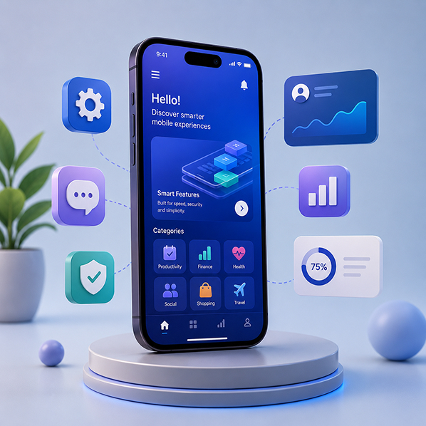
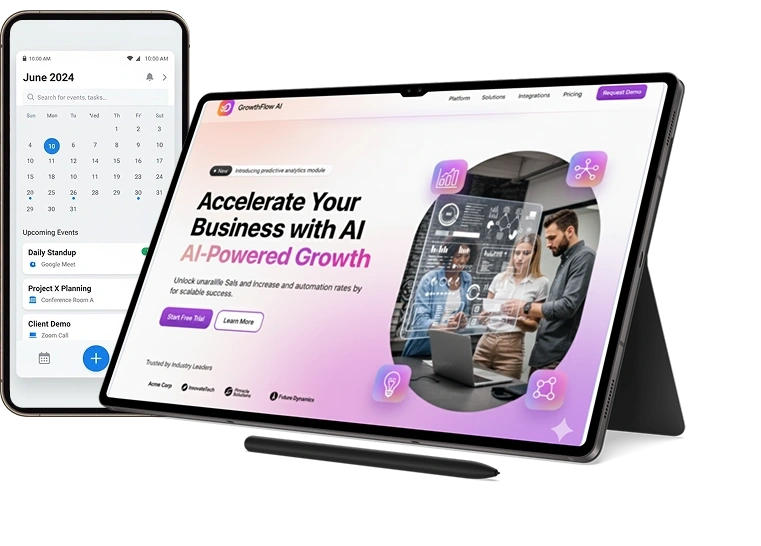
Smart Responsive Web Design for a Mobile-First World
Future Profilez specializes in responsive web design services in India, helping businesses build websites that look and perform seamlessly across all devices. Our focus is on creating mobile-friendly website experiences that ensure smooth navigation, fast performance, and consistent design across desktops, tablets, and smartphones.
Our Responsive Web Design Services
We design and develop websites that automatically adapt to any screen size while maintaining performance, usability, and visual consistency. Our responsive design solutions help businesses build modern, scalable, and user-focused digital experiences.
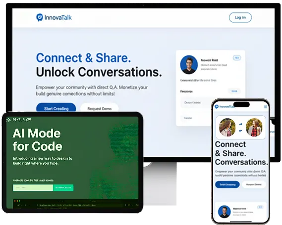
Cross-Device Responsive Website Design
We develop websites that automatically adjust layouts for desktops, tablets, and mobile devices to ensure a consistent user experience.
UX/UI Improvements for Engagement
We enhance user experience and interface design to improve engagement, interaction, and customer retention.
Custom Responsive Themes
We design custom responsive themes that match your brand identity while ensuring flexibility across all devices.
Custom Responsive Web Design Services Provided
Adaptive Layouts for All Screen Sizes
We create flexible layouts that maintain readability, structure, and usability across different device resolutions.
Mobile-Optimized Website Design
We ensure mobile users experience smooth navigation, faster load times, and optimized visual layouts.
Performance & Usability Testing
We test responsiveness, speed, and usability across devices and browsers to ensure flawless performance.
Why Your Business Needs Responsive Web Design
In a mobile-first digital environment, users expect websites to work seamlessly on every device. A responsive website improves user experience, increases engagement, and supports better search engine visibility. Responsive design ensures your website remains accessible, fast, and user-friendly regardless of screen size.
Why choose Responsive Design Services?
 Consistent experience across all devices
  Improved search engine visibility
 Faster loading performance
 Better user engagement
 Higher conversion rates
 Reduced bounce rates
Why Choose Future Profilez?
We build responsive websites that not only look visually appealing but also perform efficiently across all platforms. Our focus is on delivering measurable results through design, performance, and user experience..

Custom & scalable web design solutions

Experienced UI/UX design team

Affordable development packages

SEO-friendly website structure

24/7 support & maintenance

Timely project delivery
Frameworks and Technologies Behind Responsive Web Design
We use modern frontend technologies and responsive frameworks to build high-performing websites that adapt seamlessly to all screen sizes.
Our Other On-Demand Services
We provide end-to-end digital solutions designed to help businesses grow, scale, and improve customer engagement through modern web technologies.